
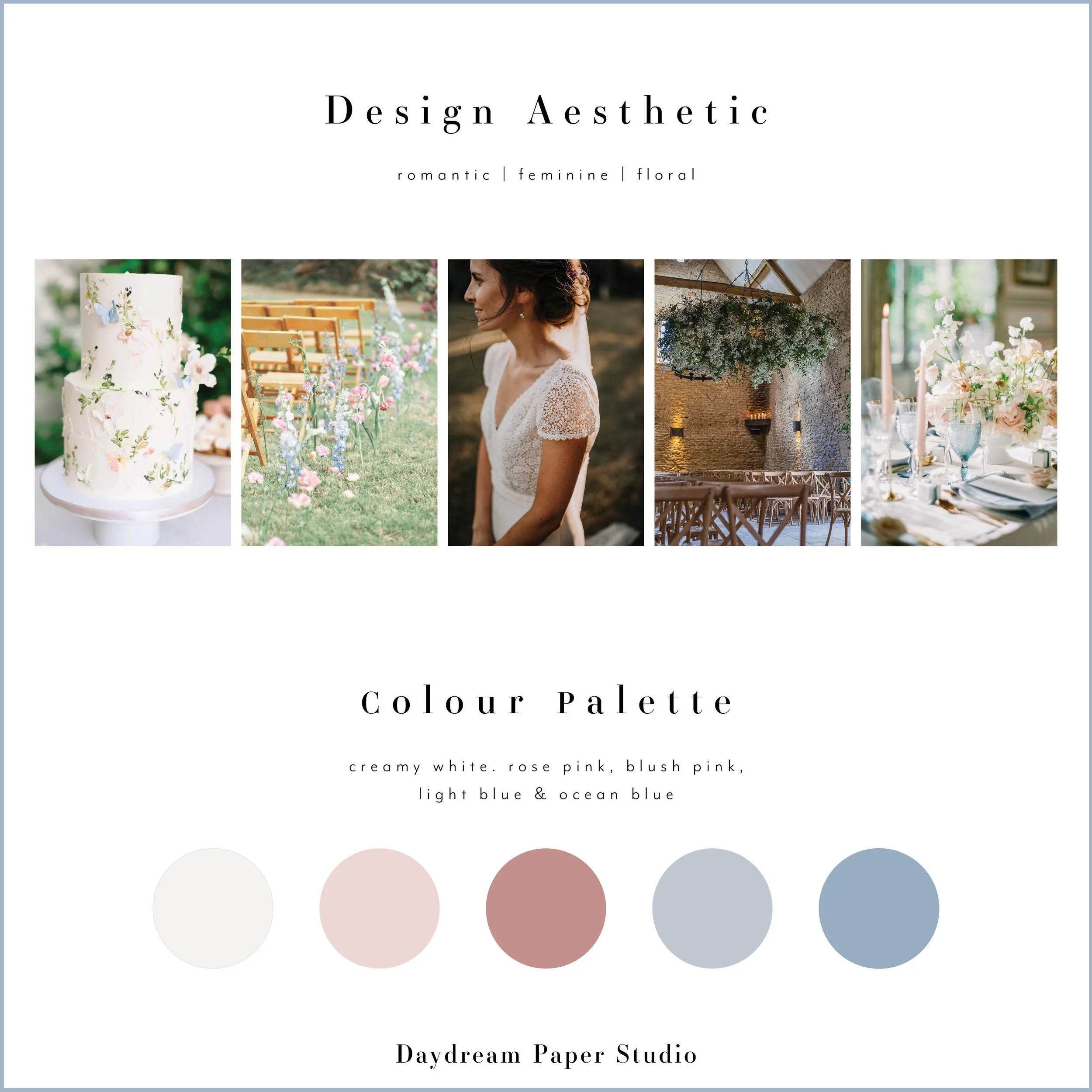
How to Choose the Perfect Color Palette for Your Wedding Invitations
Choosing the perfect color palette for your wedding invitations is one of the most exciting steps in setting the tone for your big day. Your invitations are the first glimpse your guests will have of your wedding aesthetic, and the colors you choose help convey the mood, style, and personality of your celebration.
At Daydream Paper Studio, we adore soft, romantic hues, delicate floral watercolor illustrations, and a timeless, elegant design aesthetic. If you’re wondering how to select the perfect color palette for your wedding stationery, this guide will walk you through everything you need to know.

Why Your Invitation Color Palette Matters
Your wedding invitation suite is more than just an announcement—it’s a reflection of your love story. The colors you choose will set the stage for your wedding theme and create a sense of harmony between your stationery, décor, and floral arrangements.
Here’s why your color palette is important:
Sets the tone – Soft pastels create a romantic and whimsical feel, while neutral tones evoke timeless elegance.
Creates cohesion – Your invitation colors should complement your overall wedding palette for a seamless look.
Evokes emotion – Different colors convey different moods; for example, blush pink feels romantic, while sage green is fresh and organic.
Color Palettes We Love at Daydream Paper Studio
At Daydream Paper Studio, we specialize in refined, elegant, and effortlessly beautiful wedding stationery. Here are some of our favorite color palettes and how they can bring your invitations to life.
1. Soft Pastels – Timeless & Romantic
Perfect for: Spring & Summer Weddings
Soft pastels are a classic choice for wedding invitations, evoking romance and sophistication. Shades like blush pink, dusty blue, soft lavender, and pale peach create a dreamy and ethereal look.
Pair with: Elegant script fonts and delicate watercolor florals for an effortlessly romantic feel.
Petal Collection Inspiration Board
2. Neutral Elegance – Understated & Chic
Perfect for: Classic, Minimalist & Modern Weddings
For couples who love a timeless and refined aesthetic, neutral tones like warm ivory, soft taupe, dove gray, and champagne are effortlessly elegant. These shades create a sophisticated invitation suite that never goes out of style.
Pair with: Gold foil accents, letterpress printing, and embossed details for a luxurious touch.

Poppy Collection
3. Sage & Soft Greens – Organic & Nature-Inspired
Perfect for: Garden & Outdoor Weddings
Sage green and other soft botanical hues bring a fresh, organic feel to wedding invitations. These shades are perfect for nature-loving couples who want an effortlessly elegant yet relaxed aesthetic.
Pair with: Watercolor greenery illustrations and handwritten-style fonts for a botanical, romantic touch.

Poppy Collection Inspiration Board | Sage Colorway Option
4. Blue Hues – Classic & Serene
Perfect for: Coastal, Countryside & Elegant Weddings
Shades of dusty blue, French blue, and soft periwinkle create an air of refinement and serenity. Blue tones are timeless and pair beautifully with classic serif fonts and delicate floral details.
Pair with: Vellum Wraps, silk ribbon, and vintage-inspired typography for a refined, old-world charm.

Fleur Collection
5. All-White Elegance – Chic & Timeless
Perfect for: Year-Round Weddings
An all-white palette is the epitome of timeless elegance. From crisp ivory to soft alabaster, layering different shades of white creates depth and texture while maintaining a sophisticated, clean aesthetic. Whether you’re planning a winter wonderland wedding or a sleek summer soirée, an all-white palette exudes effortless luxury and refinement.
Pair with: Embossed textures, letterpress printing, and silk ribbons for a sophisticated, tactile experience that feels both modern and classic.

Astrid Collection
How to Choose Your Wedding Invitation Colors
1. Consider Your Wedding Season
Each season naturally lends itself to different color palettes:
Spring: Blush, lilac, soft blue, and sage green
Summer: Peach, coral, pale yellow, and dusty blue
Autumn: Warm neutrals, soft terracotta, and muted greens
Winter: Cool ivory, frosted blue, and champagne gold
Tip: Think about the colors naturally found in your wedding season for an effortlessly cohesive look.
2. Draw Inspiration from Your Venue
Your venue plays a big role in shaping your wedding’s overall aesthetic. A grand estate may lend itself to classic neutrals and gold accents, while a garden wedding might be better suited to soft greens and floral pastels.
Tip: If your venue has standout architectural details or floral gardens, incorporate those elements into your stationery color palette.
3. Coordinate with Your Florals
Your wedding flowers and invitation suite should feel harmonious. If you’re featuring soft pink peonies, white roses, and eucalyptus greenery, consider incorporating those hues into your stationery.
Tip: Ask your florist for a color breakdown of your bouquet to help guide your invitation colors.


4. Keep Readability in Mind
While soft colors are beautiful, make sure your text is easy to read. Avoid light text on a light background, and opt for darker ink when needed.
Tip: For an ultra-refined look, use letterpress printing to create contrast and texture.
5. Trust Your Personal Style
At the end of the day, your wedding invitations should reflect your personal style as a couple. Choose colors that make you happy, feel timeless, and complement your overall vision.
Tip: Order a sample set to see how colors look in person before making your final decision.
Final Thoughts
Choosing the perfect color palette for your wedding invitations is all about finding hues that feel personal, elegant, and cohesive with your overall wedding vision. Whether you love soft pastels, warm neutrals, or delicate botanical greens, the key is to create a suite that feels timeless and uniquely you.
At Daydream Paper Studio, we specialize in semi-custom wedding stationery designed with soft, romantic hues, delicate watercolor details, and an effortlessly elegant aesthetic. Browse our collections or get in touch to personalize your perfect wedding invitation suite.
Love what you’re reading? Get our free guide, Wedding Invitations, Simplified. Your thoughtfully designed roadmap to what you need, when to order, and how to make your stationery unforgettable. Get the Guide